Blog
Bootstrap elements
Posted on August 12, 2023 • 10 min read • 2,053 wordsCreating a visually appealing and responsive website can be a breeze with the right tools, and Hugo coupled with Bootstrap elements is a powerful combination. In this blog post, we'll explore how to leverage shortcodes to effortlessly integrate common Bootstrap components into your site. Whether you're looking to add buttons, alerts, or grids, these pre-defined shortcodes will streamline your development process, making it simpler to build a sleek, professional site without delving deep into the intricacies of Bootstrap's extensive classes and markup.

Hinode provides several shortcodes that wrap common Bootstrap components. Refer to the official documentation for more details.
Abbr
As an example, the following shortcode displays the full text of an abbreviation on hover.
Accordion
As an example, the following shortcode displays an accordion with three elements, of which the first element is expanded.
show to the class argument.{{< accordion >}}
{{< accordion-item header="Accordion Item #1" show="true" >}}
This is the first item's accordion body. It supports HTML content, if enabled in the goldmark
renderer. The item is shown by adding the value `show` to the `class` argument.
{{< /accordion-item >}}
{{< accordion-item header="Accordion Item #2" >}}
This is the second item's accordion body.
{{< /accordion-item >}}
{{< accordion-item header="Accordion Item #3" >}}
This is the third item's accordion body.
{{< /accordion-item >}}
{{< /accordion >}}Alert
As an example, the following shortcode displays a simple alert.
{{< alert color="danger" dismissible="true" >}}
    A simple danger alert—check it out!
{{< /alert >}}
Badge
Use the badge shortcode to display a badge for a heading.
Heading 1 New {.h1}
Heading 2 New {.h2}
Heading 3 New {.h3}
Heading 4 New {.h4}
Heading 5 New {.h5}
Heading 6 New {.h6}
Heading 1 {{< badge title="New" >}}
{.h1}

Heading 2 {{< badge title="New" >}}
{.h2}

Heading 3 {{< badge title="New" >}}
{.h3}

Heading 4 {{< badge title="New" >}}
{.h4}

Heading 5 {{< badge title="New" >}}
{.h5}

Heading 6 {{< badge title="New" >}}
{.h6}
Breadcrumb
As an example, the following shortcode displays a breadcrumb for the blog page.
{{< breadcrumb path="blog" >}}Button
As an example, the following shortcode displays a tooltip for a dark button with a badge.
{{< button color="secondary" tooltip="Click on the inbox to view your unread messages" href="#!" badge="99+" >}}
    Inbox
{{< /button >}}
Button group
As an example, the following shortcode displays a group of three buttons.
{{< button-group aria-label="Basic example" >}}
  {{< button color="primary" href="#!" >}}Left{{< /button >}}
  {{< button color="primary" href="#!" >}}Middle{{< /button >}}
  {{< button color="primary" href="#!" >}}Right{{< /button >}}
{{< /button-group >}}
Card
As an example, the following shortcode displays a stacked card that links to the about page. It includes a custom header.
April 11, 2022 • 1 min read
About
{{< card path="about" padding="3" class="col-6 mx-auto" color="body-tertiary"
  header="publication" footer="none" button=true />}}
Card group
As an example, the following shortcode displays a card group of three elements.
Bootstrap framework
Full text search
Development tools
{{< card-group padding="3" gutter="3" >}}
    {{< card title="Bootstrap framework" icon="fab bootstrap" >}}
        Build fast, responsive sites with Bootstrap 5. Easily customize your site with the source
        Sass files.
    {{< /card >}}
    {{< card title="Full text search" icon="fas magnifying-glass" >}}
        Search your site with FlexSearch, a full-text search library with zero dependencies.
    {{< /card >}}
    {{< card title="Development tools" icon="fas code" >}}
        Use Node Package Manager to automate the build process and to keep track of dependencies.
    {{< /card >}}
{{< /card-group >}}
Carousel
As an example, the following shortcode displays a centered carousel with three slides, 16x9 aspect ratio, and a relative width of 67% on large screens.
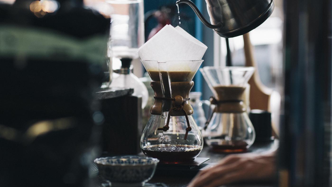


{{< carousel ratio="16x9" class="col-sm-12 col-lg-8 mx-auto" >}}
  {{< img src="img/coffee.jpg" caption="slide 1" >}}
  {{< img src="img/phone.jpg" caption="slide 2" >}}
  {{< img src="img/dunes.jpg" caption="slide 3" >}}
{{< /carousel >}}
Collapse
As an example, the following shortcode displays a button that, when clicked, triggers a panel to appear or disappear.
{{< button collapse="collapse-1" >}}
    Trigger panel
{{< /button >}}

{{< collapse id="collapse-1" class="p-3 border rounded bg-primary-subtle" >}}
    Some placeholder content for the collapse component. This panel is *hidden by default* but
    revealed when the user activates the relevant trigger.
{{< /collapse >}}
Command prompt
Use the command shortcode to generate a block with a default bash command prompt.
export MY_VAR=123{{< command >}}
export MY_VAR=123
{{< /command >}}Specify user and host to add the user context to the prompt. In addition, use (out) to specify an output line and use \ to denote a line continuation.
export MY_VAR=123
echo "hello"
#hello
echo one \
two \
three
#one two three
echo "goodbye"
#goodbye{{< command user="user" host="localhost" >}}
export MY_VAR=123
echo "hello"
(out)hello
echo one \
two \
three
(out)one two three
echo "goodbye"
(out)goodbye
{{< /command >}}Docs
Use the docs shortcode to display the content of a js, scss or toml file:
[style]
    primary = "#d43900"
    secondary = "#6c757d"
    success = "#198754"
    info = "#0dcaf0"
    warning = "#ffc107"
    danger = "#dc3545"
    light = "#f8f9fa"
dark = "#212529"Example
Use the example shortcode to display a code example and to render a preview of the same input.
export MY_VAR=123{{< command >}}
export MY_VAR=123
{{< /command >}}File
Use the file shortcode to print and highlight the full content of a given input file.
# toml-docs-start lang-main
[en]
    languageName = "English"
    contentDir = "content"
    weight = 1
# toml-docs-end lang-main
# toml-docs-start lang-param
    [en.params.head]
        tagline = "A Hugo Theme"
    [en.params.social]
        title = "Follow me"
        caption = "I work on everything coding and tweet developer memes"
    [en.params.footer]
        # license = "Licensed under Creative Commons (<a href='https://creativecommons.org/licenses/by-nc-sa/4.0/' class='link-secondary' target='_blank' rel='noopener noreferrer'>CC BY-NC-SA 4.0</a>)."
# toml-docs-end lang-param{{< file path="./config/_default/languages.toml" id="file-collapse-1" >}}Icon
As an example, the following shortcodes show a square check, a brand logo, a circle check, and a custom icon.
{{< fa square-check >}}
{{< fab linkedin >}}
{{< fas circle-check >}}
{{< icon custom activity >}}
Image
As an example, the following shortcode displays an image with rounded corners and a 21x9 aspect ratio.
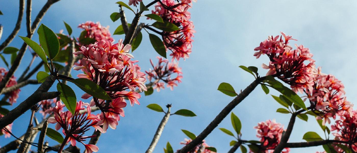
{{< image src="img/flowers.jpg" ratio="21x9" caption="Figure caption" class="rounded" >}}As an example, the following shortcode displays a regular vector image.
{{< image src="/hinode-books/img/logo_icon.svg" class="col-sm-6 col-lg-4" wrapper="text-center" >}}As an example, the following shortcode displays a vector image with a symbol reference.
{{< image src="/hinode-books/img/logo_var.svg#logo" class="col-sm-6 col-lg-4" wrapper="text-center" >}}Link
As an example, the following shortcodes render links in different formats.
- {{< link hinode >}}Named link with default settings{{< /link >}}
- {{< link name=hinode cue=false tab=false >}}Named link opening in current tab w/o icon{{< /link >}}
- {{< link name=hinode cue=true tab=true >}}Named link opening in new tab with icon{{< /link >}}
- {{< link hinode />}}
- {{< link href="https://developer.mozilla.org" >}}External link{{< /link >}}
- {{< link "#image" />}}
- {{< link "components/#map" />}}
Mark
Use the mark shortcode to highlight text. The inner content is used as input.
Use the mark shortcode to {{< mark >}}highlight{{< /mark >}} specific text.Nav
As an example, the following shortcode displays a tab group with vertically aligned pills.
  {{< nav type="pills" vertical="true" >}}
    {{< nav-item header="Nav Item #1" show="true" >}}
      This is the first item's nav body. It supports HTML content, if enabled in the goldmark
      renderer. The item is shown by adding the value `show` to the `class` argument.
    {{< /nav-item >}}
    {{< nav-item header="Nav Item #2" >}}
      This is the second item's nav body.
    {{< /nav-item >}}
    {{< nav-item header="Nav Item #3" >}}
      This is the third item's nav body.
    {{< /nav-item >}}
  {{< /nav >}}
Navbar
As an example, the following shortcode displays a light navigation header.
Persona
As an example, the following shortcode displays a persona card with a primary color.

Creators
As a content creator you value your independence. You like to take control of your online and offline presence. You want to focus on growing your audience, without limitations.
Hinode gives you the tools to publish your blog in the way that you want. You have full ownership and control of your content. That is why content creators choose Hinode.
{{< persona thumbnail="/img/creator-1x1.jpg" title="Creators" color="primary" >}}
  As a content creator you value your independence. You like to take control of your
  online and offline presence. You want to focus on growing your audience, without
  limitations.

  Hinode gives you the tools to publish your blog in the way that you want. You have
  full ownership and control of your content. That is why content creators choose
  Hinode.
{{< /persona >}}
Release
As an example, the following shortcode displays a default release button.
Spinner
As an example, the following shortcode displays a centered spinner.
{{< spinner color="info" class="text-center" >}}
Loading...
{{< /spinner >}}
Sub
As an example, the following shortcode displays subscript text.
H{{< sub 2 >}}O is a liquid.Sup
As an example, the following shortcode displays superscript text.
2{{< sup 10 >}} is 1024.Table
As an example, the following shortcode displays a responsive table.
| # | Heading | Heading | Heading | Heading | Heading | Heading | Heading | Heading | Heading |
|---|---|---|---|---|---|---|---|---|---|
| 1. | cell | cel | cel | cel | cel | cel | cel | cel | cel |
| 2. | cell | cel | cel | cel | cel | cel | cel | cel | cel |
| 3. | cell | cel | cel | cel | cel | cel | cel | cel | cel |
{{< table >}}
| #  | Heading | Heading | Heading | Heading | Heading | Heading | Heading | Heading | Heading |
|----|---------|---------|---------|---------|---------|---------|---------|---------|---------|
| 1. | cell    | cel     | cel     | cel     | cel     | cel     | cel     | cel     | cel     |
| 2. | cell    | cel     | cel     | cel     | cel     | cel     | cel     | cel     | cel     |
| 3. | cell    | cel     | cel     | cel     | cel     | cel     | cel     | cel     | cel     |
{{< /table >}}
Timeline
As an example, the following shortcode displays a timeline with the file data/timeline.en.yml as data.
Toast
As an example, the following shortcode displays a button that, when clicked, triggers the toast message.
markdown.markdown.{{< button toast="toast-example-1" >}}
Show toast 1
{{< /button >}}
{{< button toast="toast-example-2" >}}
Show toast 2
{{< /button >}}
{{< toast id="toast-example-1" header="First title" >}}
This is the first toast message. It supports `markdown.`
{{< /toast >}}
{{< toast id="toast-example-2" header="Second title" >}}
This is the second toast message. It supports `markdown.`
{{< /toast >}}Tooltip
As an example, the following shortcode displays a tooltip for a colored hyperlink.
{{< tooltip color="primary" title="Tooltip caption" href="#!" >}}Tooltip{{< /tooltip >}} demonstration